top of page


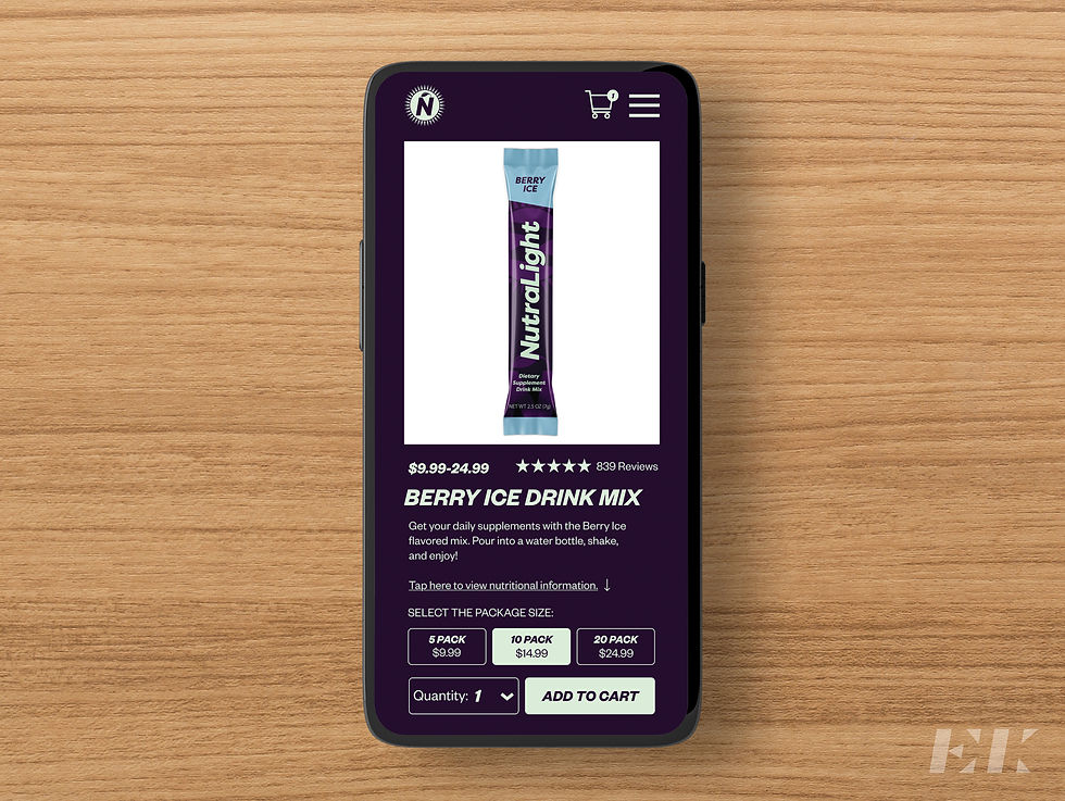
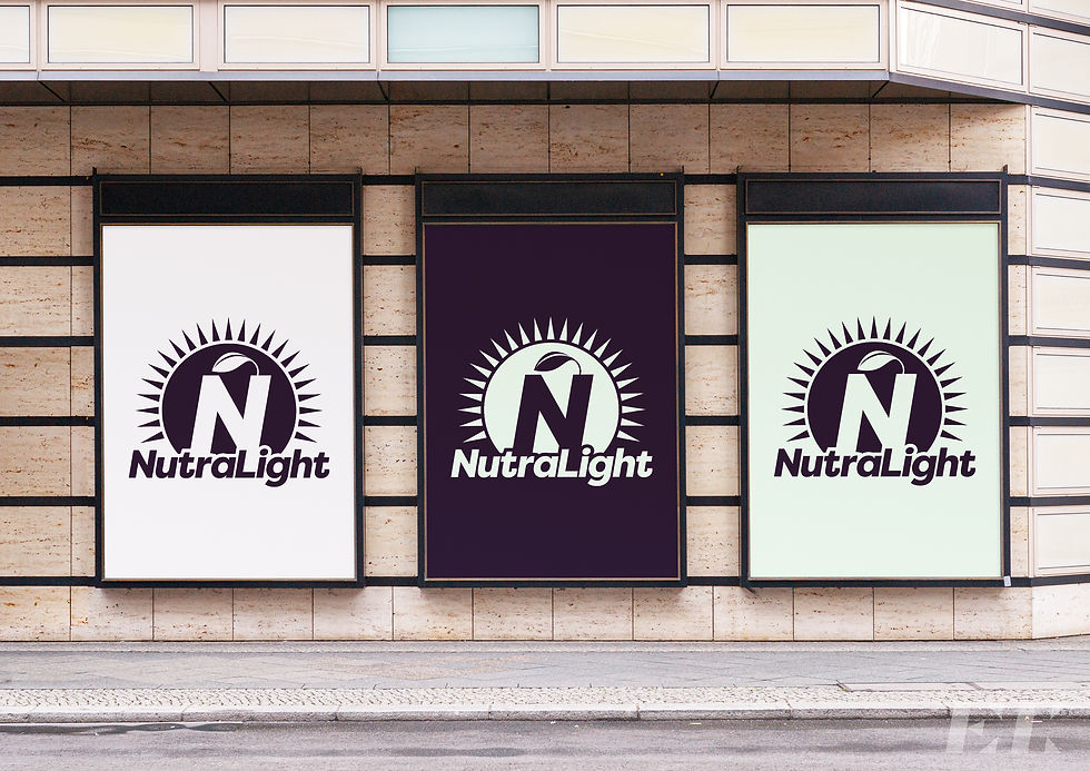


NutraLight is a newly founded health company that looks to provide new ways to gain nutrition. For its branding, most of the colors chosen were more mute and soft to give the viewer a comforting feeling. The blues represent the sky and oceans while the greens represent nature and plants. The dark violet is used to contrast with these while also giving a sense of power and royalty to the customer. The logo is a sun to represent the its nutrtiion, especially vitamin C, an important element of the NutralLight products. The website uses the purple colors to not only tie into the branding but to also make it stand out from other supplement websites that may use a white or black background.
bottom of page